Project 1
Accessibility Redesign of the
Sign Language Alphabet Ireland App

In 2016, my husband and I built the Sign Language Alphabet Ireland app as our first side project. After completing UX design courses in 2022 and 2023, I revisited the app with a new goal: redesign it with accessibility at the core.
“ ...How might we design an app that is both accessible and seamless to use? ”
The first version was functional but had usability and accessibility gaps. My mission was to create an inclusive, intuitive learning tool that aligned with WCAG accessibility standards.
Rethinking the User Journey
During the design exploration, I applied a technique from the Google UX Certificate course by framing key challenges as 'How might we…' questions:

How might we declutter the interface by moving secondary actions into a dropdown menu instead of crowding the main screen?
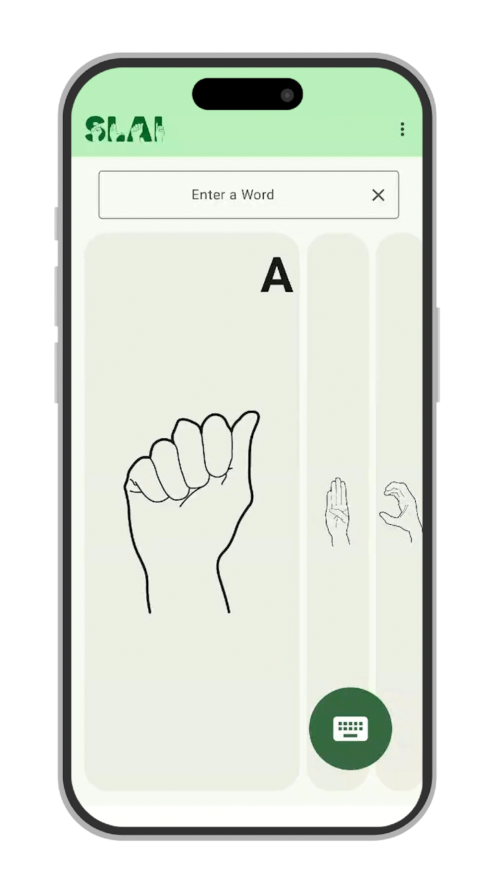
How might we present the alphabet in a swipeable carousel instead of individual cards?
How might we refresh the visual identity by redesigning the logo?
Since this is a sign language learning app, how might we ensure accessibility by aligning with the highest WCAG standards?
How might we simplify the experience by removing multiple buttons and consolidating everything into a single main screen?

-
How might we present the alphabet in a swipeable carousel instead of individual cards?
-
How might we declutter the interface by moving secondary actions into a dropdown menu instead of crowding the main screen?
-
How might we refresh the visual identity by redesigning the logo?
-
Since this is a sign language learning app, how might we ensure accessibility by aligning with the highest WCAG standards?
-
How might we simplify the experience by removing multiple buttons and consolidating everything into a single main screen?
Visual Identity Redesign

Old Logo
-
Weak connection to sign language (tiny hand + puzzle piece can be missed).
-
Looked corporate, not community-focused
-
Not very memorable.
New Logo
-
Hands spell out “SLAI” for an instant sign language connection
-
Irish green as the main brand color, tying to culture and identity
-
Community-focused, inclusive, and playful
-
Hands integrated into letters for a symbolic, creative design
Overall
The new logo communicates the mission of Sign Language Alphabet Ireland at first glance—something the old one lacked.
Accessibility-First Design


I designed and implemented a complete color system using Material Theme Builder, making sure every shade felt consistent across the product and could be handed off smoothly to developers without confusion. Alongside that, I refined the text styles and sign illustrations to improve readability, paying particular attention to accessibility for users with low vision.
WCAG Compliance at the Highest Standard
Throughout the process, I ensured that all assets met WCAG 2.1 AAA standards, addressing color contrast, touch target sizing, and navigation clarity. Accessibility wasn’t just an added feature—it became the guiding principle at the heart of the redesign.

Before
After
Results
Optimized the app flow by merging multiple screens into a single, seamless main screen experience.
Introduced intuitive icons and larger tap targets, making it easier for users of all ages and abilities.
Reduced cognitive load by replying on recognizable visual pattterns.
Fewer clicks, faster learning, more engaging experience
Added a carousel to swipe through alphabet cards instead of clicking each card individually.
-
Optimized the app flow by merging multiple screens into a single, seamless main screen experience.
-
Added a carousel to swipe through alphabet cards instead of clicking each card individually.
-
Fewer clicks, faster learning, more engaging experience
-
Introduced intuitive icons and larger tap targets, making it easier for users of all ages and abilities.
-
Reduced cognitive load by replying on recognizable visual pattterns.
The redesign turned the app into an inclusive and culturally connected tool:
-
A strong, clear visual identity
-
A simple learning flow that kept users engaged
-
Accessibility built into every part of the experience
Tools & Skills Used
Reflections
This project reminded me that UX is about empathy and inclusion as much as visuals. By rethinking branding, navigation, and accessibility together, I turned a side project into a tool that truly serves its community. I also gained hands-on experience with Material Theme Builder and tokens, which improved collaboration with developers and streamlined workflow.