Project 2
Enhancing Search Results to Empower Airline App Users

As part of my UXDI studies, I worked on enhancing an airline app’s booking user flow. The project covered the full UX process, from problem definition to final solution, using methods such as affinity diagrams, journey mapping, flow diagrams, prototyping, and developer handoff.
“ ...How might we help users find the best date and price with confidence and ease? ”
Research showed that users felt frustrated when comparing prices across dates. Many also found pricing plans confusing, which made decisions harder.
Research & Discovery
Competitive Benchmarking
I looked at other airline apps to see how they managed search flows and filters.
User Research
I watched usability test videos and noted how users behaved and felt during booking. I also interviewed friends and family. The biggest issues I found were:
-
Comparing prices across dates was tiring
-
Fare plans were hard to understand
See all resources: Affinity Diagram, Flow Diagrams
Synthesis
To organize my findings, I used:
-
Affinity Diagram: grouped user frustrations with classmates
-
Customer Journey Map: tracked emotions during the booking process
-
Flow Diagrams: simplified the search flow for mobile


Design Process
Prototyping for Mobile
Users needed an easier way to browse dates and prices, and to quickly understand what each fare included.
I focused on:
-
Consistency in interactions
-
Clear and simple data resentation
-
Accessibility in navigation and typography
I designed a clean UI with:
-
A swipeable price feature showing week-long fares
-
Clear visual breakdowns of flight plans
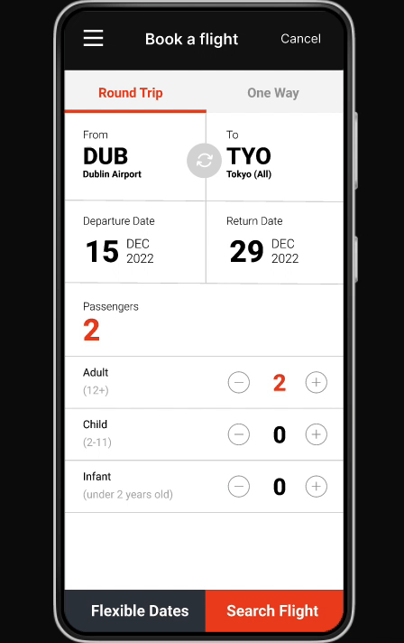
Defining the Problem
Design Principles
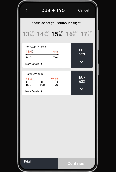
Key Solution:
Flexible Price Explorer
The standout feature was a swipeable weekly price calendar. It let users:
-
View all prices for a week at once
-
Swipe left or right to compare
-
Instantly spot the lowest fare
This directly reduced “comparison fatigue” and made decisions faster and easier.
Testing & Refinement
-
Ran usability tests on mobile prototypes
-
Iterated designs based on completion rates and feedback
-
Added clear annotations for developer handoff
Each version improved clarity, and users found date/price matches quicker with less confusion.


Results
-
Reduced frustration in flexible date searches
-
Improved task success rates in testing
-
Pricing plans now explained clearly at a glance
-
Booking process felt smoother and more enjoyable
Tools & Skills Used
-
UX principles & design systems
-
Mobile interaction design
-
Developer handoff & annotation
Reflections
This project showed me how usability challenges can directly impact decision-making. What started as a flight search became a study in reducing friction and empowering users. I also learned the importance of design systems, collaboration, and consistent patterns when working on complex experiences.